- The pbix file created for this blog post can be found in my GitHub here.
Introduction
Since Power BI started to support R visual, it has become difficult to criticise Power BI’s visualisation capability because we can now take full advantage of R’s powerful visualisation packages such as ggplot2 to create Power BI reports. Unlike creating Power BI custom visual which is a rather time-consuming task, we can create eye-catching charts in just a few of lines with R visual.
This blog post introduce an approach to create grid-facet and geo-facet types of visualisation in Power BI using ggplot2 R package.
Grid-Facet
Facet grid is a popular chart type but is not supported by Power BI yet. However, we can easily build a facet grid chart with the help of ggplot2 package.
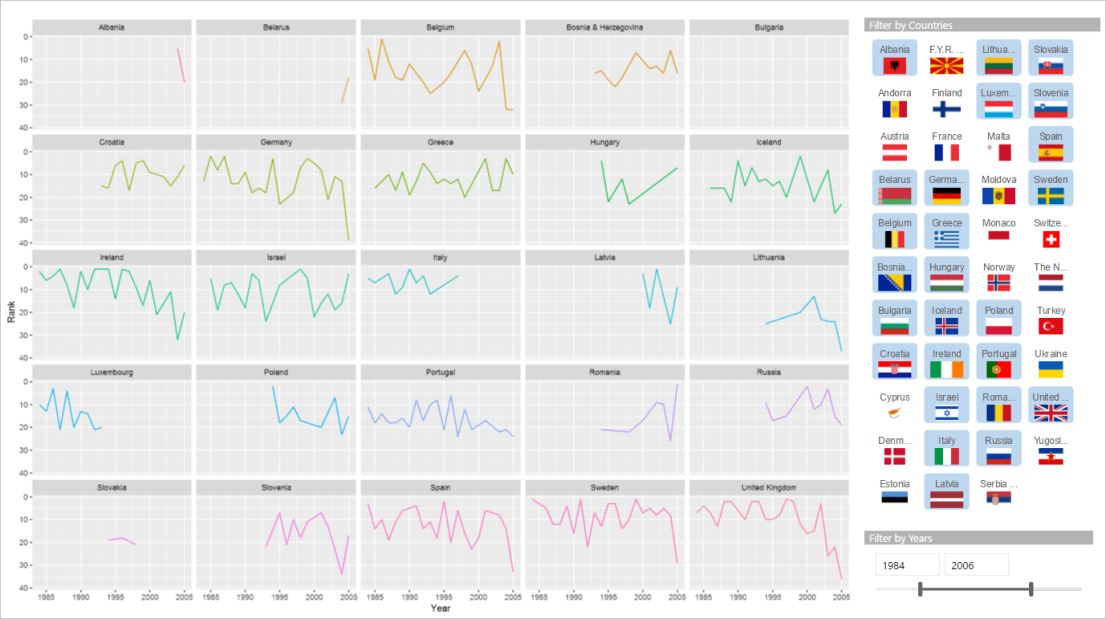
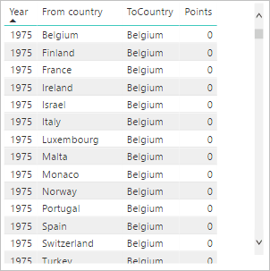
Firstly, we need to get our data into the right format. In this example, we use the Eurovision competition dataset which contains the voting records between 1975 to 2016.
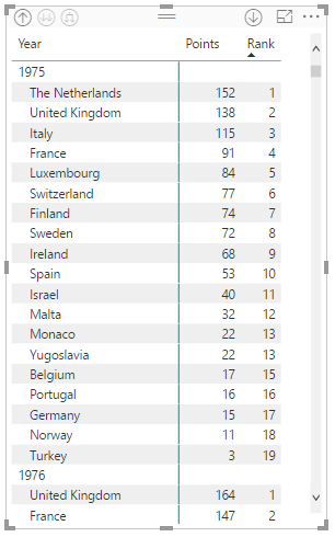
We need to calculate the rank of each country for each year based on the points they received from the rest of countries. We can use the DAX RANKX function to calculate the rank measure and get the results like:
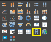
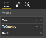
Now we are ready to create our facet grid visual. We add a R visual to the Power BI canvas and add three columns, Year, ToCountry, Rank, to the visual.
On the R script editor, we first reference the ggplot2 library and then create a ggplot object placing Year on x-axis and Rank on y-axis. The key step is to add facet_wrap(~ToCountry) that generates the facet grid by voting destination country (ToCountry column).

Geo-facet
The grid facet looks pretty neat as all sub-panels are perfectly aligned, however, it fails to display the geospatial information of the countries that may reveal some useful insights. For example, in my last blog post , I built a voting network chart of Eurovision competition that has revealed the mutual high voting scores between some neighbour countries.
There is a R package, namely geofacet, which comes with a list of pre-built geospatial grids for a number of geographical areas, countries and states. One of the pre-built grids is for Europe area which is perfect for our Eurovision example.
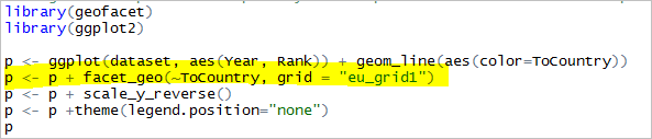
It is very straightforward to use the geofacet package. After referenced the package in our R script, all we need to do is to replace the facet_wrap function in our ggplot2 code with the facet_geo function provided by the geofacet package. We need to specify the column by which the facet is divided and the name of the pre-built grid we will use. In this example, we use “eu_grid1” which is the grid for Europe area.
Now we have done all the work to convert our standard grid facet to geospatial facet.

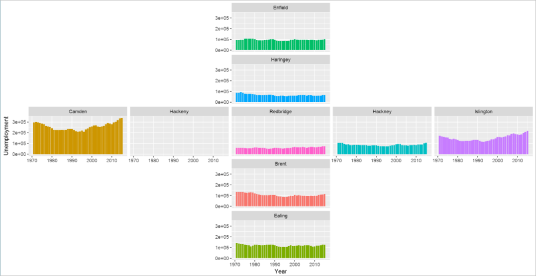
Apart from the Europe area grid, you can find a list of other pre-built grids here. Considering where I am living at this moment, another pre-built grid I am particularly interested at is the London Borough grid. This is a geo-facet chart I have created to visualise the unemployment rate in the London boroughs.
 You can also create your own grid which is literally a data frame with four columns, name and code columns that map to the facet label column in the dataset, and the row and col columns that specify the grid locations.
This is a test grid I have created to demonstrate how to create custom grid:
customGrid <- data.frame(
  name = c("Enfield", "Haringey", "Islington", "Hackney", "Camden", "Hackeny", "Redbridge", "Brent", "Ealing"),
  code = c("Enfield", "Haringey", "Islington", "Hackney", "Camden", "Hackeny", "Redbridge", "Brent", "Ealing"),
  row = c(1, 2, 3, 3, 3, 3, 3, 4, 5),
  col = c(3, 3, 5, 4, 1, 2, 3, 3, 3),
  stringsAsFactors = FALSE
)

please share pbix
Hi, the pbix file has been uploaded, please find the link at the bottom of the blog post.