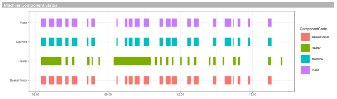
One common approach to detect exceptions of a machine is to monitor the correlative status of components in the machine. For example, in normal condition, two or more components should be running at the same time, or some components should be running in sequential order. When the components are not running in the way as expected, that indicates potential issues with the machine which need attentions from engineers.
Thanks to IoT sensors, it is easy to capture the data of component status in a machine. To help engineers to easily pick up the potential issues, a machine components timeline chart will be very helpful. However, Power BI does not provide this kind of timeline chart, and it can be time consuming to build custom Javascript-based visuals. Fortunately, we have R visual in Power BI. With a little help from ggplot2 library, we can easily build a timeline chart (as the one shown below) in four lines code.
Firstly, we need add a R visual onto Power BI canvas, and set the data fields required for the chart.

The minimal fields required are the name/code of the component, start date and end date of the component running cycle, such as:
| ComponentCode | Start DateTime | End DateTime |
| Pump | 2017-01-01 09:12:35 | 2017-01-01 09:18:37 |
| Motor | 2017-01-01 09:12:35 | 2017-01-01 09:18:37 |
In the R script editor, we use the geom_segment to draw each component running cycles. The x axis is for the time of component running, and the y axis is for the component name/code.

Apart from showing a Power BI timeline chart for engineers to detect the machine issue as this blog post introduced, we can also send alerts to engineers using Azure Functions.
