Value at Risk (VaR) is arguably the most widely used metric for risk management. It quantifies the potential loss in the value of a portfolio over a certain period. In this blog post, I will first provide an overview of VaR, clarifying its definition and discussing its advantages and disadvantages. Then, I will implement Python code for the Historical method of VaR estimation, one of the three main approaches for estimating VaR. The other two approaches, the Parametric (Variance-Covariance) method and the Monte Carlo method—will be covered in the next few blog posts.
Definition
According to the CFA curriculum, Value at Risk (VaR) is the minimum loss that would be expected a certain percentage of the time over a specified period, given assumed market conditions. The VaR concept consists three components:
- Time Horizon – the time period over which the VaR is evaluated, e.g., daily, monthly, etc.
- Confidence Level – the probability the loss will exceed the VaR, e.g., 1%, 5%, 84%, etc.
- Loss Amount – the minimum expected loss in percentages or in currency units.
For example, we now have a VaR statement as: The 1% VaR of the portfolio is 0.2% of portfolio value over a one-day period.
We can interpret this VaR metrics from the following angles:
- 0.2% of the portfolio asset value is the minimum daily loss we would expected 1% of the time.
- Within 1% time, the daily losses would be at least the 0.2% of the portfolio value.
- Within 99% time, we could expect a maximum daily loss over 0.2% of the portfolio asset value.
The Good and Bad about VaR
First, on the Good side:
- VaR is a simple concept to understand and communicate.
- VaR is a metric comparable across different asset classes, portfolios, and other dimensions.
- VaR is a handy metric for capital allocation, risk budgeting, and performance evaluations.
- VaR is verifiable trough backtesting.
- VaR is widely accepted by regulators.
The Bad side:
- VaR underestimated the risk of extreme events (tail risk) and failed to assess the severity of 2008 financial crisis.
- VaR is sensitive to inputs with a small change in the inputs can lead to significant difference of the estimation.
- VaR is not sub-additive, which cause difficulty for dimensional analysis.
Historical Method for VaR Estimation
The historical method is one of the three VaR estimation approaches covered in the CFA curriculum. It is the simplest and most intuitive compared to the parametric method and the Monte Carlo method. This approach uses historical data to simulate potential future losses, assuming that past market behaviour is repeatable in the future.
The steps involved in the historical method is very straightforward, including:
- Step 1 – Collect historical market data for the assets held in the portfolio.
- Step 2 – Calculate the historical returns
- Step 3 – Sort the historical returns from worst to best
- Step 4 – Find the right percentile based on the VaR confidence Level
- Step 5 – Calculate VaR based on the unit measure, i.e., % or currency units.
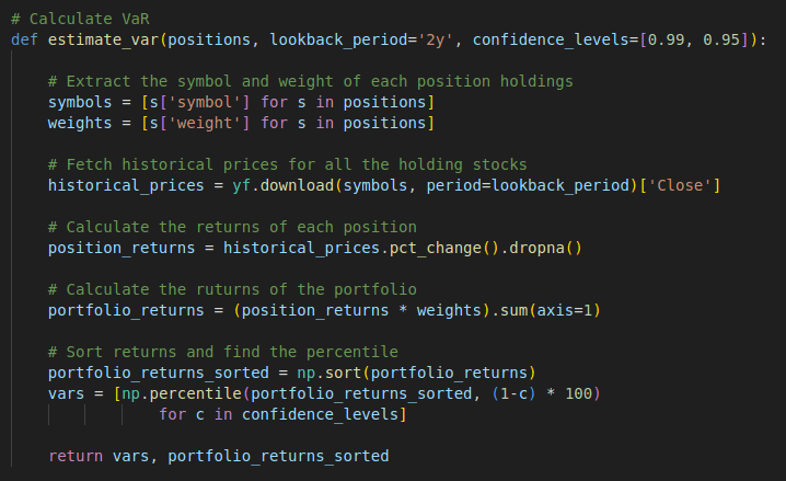
Here is the Python code I written up for the implementation of the steps above. I defined the estimate_var function which takes three arguments, the position holdings in the portfolio with the security symbol and its weight in the portfolio, the lookback_period representing the time hortizon, and the confidence levels for evaluating. The function first fetches live market data from Yahoo Finance APIs and calculates the returns of each position. It then computes the total returns of the portfolio and sorts them in ascending order. Finally, the VaR confidence level is used to determine the appropriate percentile.
Here is the test data I used.
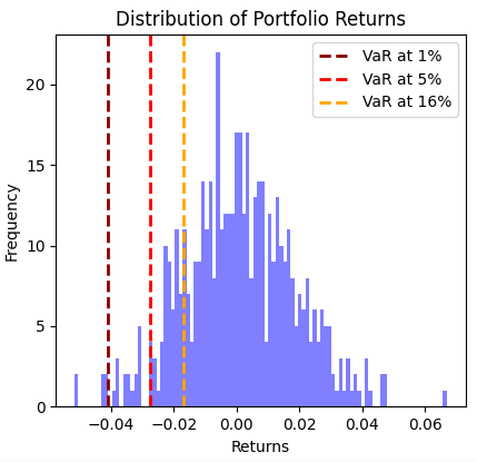
I have also created two charts to visualize the distribution of returns and the VaR values at different confidence levels. The pyplot code for generating these charts can be found in the full version of the code below.
The historical method is simple and intuitive, with no assumptions about the distribution of returns. However, this method is less useful in the real world due to its reliance on the assumption that historical patterns will repeat and its failure to account for structural changes in market conditions. In the next two blog posts, I plan to discuss the other two approaches: the parametric method and the Monte Carlo method, which are more widely used in the real world.
Full Code – Python
import numpy as np
import pandas as pd
import yfinance as yf
import matplotlib.pyplot as plt

# Calculate VaR
def estimate_var(positions, lookback_period='2y', confidence_levels=[0.99, 0.95]):

    # Extract the symbol and weight of each position holdings
    symbols = [s['symbol'] for s in positions]
    weights = [s['weight'] for s in positions]

    # Fetch historical prices for all the holding stocks
    historical_prices = yf.download(symbols, period=lookback_period)['Close']

    # Calculate the returns of each position
    position_returns = historical_prices.pct_change().dropna()

    # Calculate the ruturns of the portfolio
    portfolio_returns = (position_returns * weights).sum(axis=1)

    # Sort returns and find the percentile
    portfolio_returns_sorted = np.sort(portfolio_returns)
    vars = [np.percentile(portfolio_returns_sorted, (1-c) * 100)
                for c in confidence_levels]

    return vars, portfolio_returns_sorted

positions = [
    {'symbol': 'MSFT', 'weight': 0.5},
    {'symbol': 'TSLA', 'weight': 0.25},
    {'symbol': 'BABA', 'weight': 0.25}
]
periods = '2y'
confidence_levels = [0.99, 0.95, 0.84]

vars, returns = estimate_var(positions, periods, confidence_levels)

plt.figure(figsize=(8, 6))
plt.hist(returns, bins=100, density=False, alpha=0.5, color='blue')
plt.axvline(vars[0], color='darkred', linestyle='dashed', linewidth=2, label=f'VaR at {int((1-0.99) * 100)}%')
plt.axvline(vars[1], color='red', linestyle='dashed', linewidth=2, label=f'VaR at {int((1-0.95) * 100)}%')
plt.axvline(vars[2], color='orange', linestyle='dashed', linewidth=2, label=f'VaR at {int((1-0.84) * 100)}%')
plt.title('Distribution of Portfolio Returns')
plt.xlabel('Returns')
plt.ylabel('Frequency')
plt.legend()
plt.show()

counts, bin_edges = np.histogram(returns, bins=100)
index = list(range(100))
bin_midpoints = (bin_edges[:-1] + bin_edges[1:]) / 2
plt.figure(figsize=(8, 6))
plt.barh(index, bin_edges[:-1], color='blue', label='Returns')
plt.axhline(y=1, color='darkred', linestyle='--', linewidth=2, label=f'VaR at {int((1-0.99) * 100)}%')
plt.axhline(y=5, color='red', linestyle='dashed', linewidth=2, label=f'VaR at {int((1-0.95) * 100)}%')
plt.axhline(y=16, color='orange', linestyle='dashed', linewidth=2, label=f'VaR at {int((1-0.84) * 100)}%')
plt.xlabel('Returns')
plt.ylabel('Rank')
plt.title('Daily Returns Rank')
plt.legend()
plt.show()


